Think big in tiny premium homes. ”The luxury of time is a value that can replace the luxury of space”
Those living in Hong Kong, Tokyo, London, Paris, New York, Beijing know space is a form of luxury nowadays. The number of the world’s mega-cities, with a population greater than 10 million people is steadily increasing. Now, there are over 31 around the world. So, a smart use of residential space is becoming crucial. Here is the proof that it is possible to think big in tiny spaces.
Small-space living is almost a norm in large cities with huge property prices. Architects and designers are practically forced to come up with ingenious and space-saving arrangements for compact spaces.
However, this new way of living has many benefits – you can save time and money while you have the privilege to live in the city center, closer to all the conveniences that you need.
“The luxury of time is a value that can replace the luxury of space if you are willing to live in a smaller, more compact home,” said German architect Sigurd Larsen in the introduction of “Small Homes, Grand Living,” a new book by Gestalten.
According to Larsen, tinier homes attract lower rents and help save the planet, as shared facilities and energy savings make compact living in highly populated areas “the most efficient form of accommodation.”
“They are retreats within which our weekly routines occur, and hence they contain the potential to contribute fundamentally to the quality of our everyday lives,” Larsen pointed out.
The next big thing in real estate?
Thanks to problems like rising housing costs, overpopulation, and environmental damage, it seems the solution is to think big in a tiny but still premium place.
There are some famous architecture firms that already respond to this trend by coming up with cutting-edge ideas. Also, designers are increasingly responding to the need to live in small homes with furniture that maximize every inch of the floors, walls, and the ceiling.
Here are 5 of the smallest but at the same time practical homes around the world. They have bedrooms, bathrooms, and kitchens. Just because they’re so tiny doesn’t mean that they can’t be livable, efficient and really nice. Architects and designers are following the micro homes movement, creating intriguing and attracting designs:
London
Studiomama used personalized plywood furniture to to create a cohesive interior, packing a fold-out bed, a standing desk and extendable dining benches into this 13-square-metre apartment – which claims to the title of London’s smallest house, described as cabin-like.
“A tiny space like this has to be designed like one would design the interior of a caravan or boat. Everything has to be custom designed as there is not room for any off the shelf furniture, which was a great challenge.” said studio co-founder Nina Tolstrup, cited by Dezeen.com.
“We have created integrated storage and seating elements which have discreet dual functions and can easily extend to add extra surfaces for seating or working. We wanted to get the space to work intuitively, without too many electronic or hidden functions.” Tolstrup explained.
Sidney
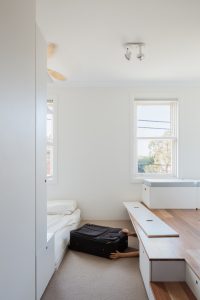
Australian architect Nicholas Gurney has used bespoke joinery, sliding partitions and movable furniture to create the best possible space inside this 22-square-metre apartment in Redfern, Sydney.
“To best exploit the generous ceiling height, a platform accessed via two steps was installed to one half of the apartment providing a further 11sqm of usable floor area. A slide-out bed on a lightweight perspex sled lives beneath the platform during the day. Modular storage seating and a flip-down table locked in place and supported by the bookends from the wall shelves above provide added flexibility in the use of space. Space vacated by the bed provides access to crawl space under the platform. Drawers housed within the two steps provide unexpected storage,” the architect explains.

To make sure each of the clients’ belongings has its own place in the space-tight apartment, he usually follows a Japanese method of organisation known as 5S. The five principles are: sort, straighten, shine, standardise and sustain.
All of these principles aim to encourage a more disciplined and efficient use of the space. In accordance with this, the clients are asked to compile a list of belongings so that storage could be designed correspondingly.
New York
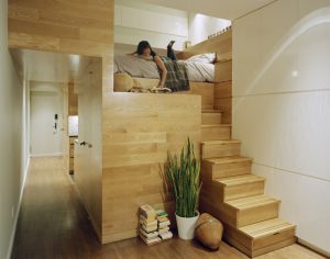
Living and working in under 500 square feet, the client had been pushing the limits of what his apartment, in its current configuration, would accommodate. After walking the space with the client, observing and listening, JPDA established some clear design objectives for the remodel. The first step was to get rid of the clutter – storage and lots of it, the second was to define and organize the functional spaces for cooking, cleaning, dressing and sleeping, lending at the same time some visual clarity to the environment.

The third was to make it more “grown-up”, as architects explain: “A restrained minimal palette would help make the small home an inviting retreat from the city below. The solution was ultimately about exploiting every opportunity for storage, and then combining those spaces and the kitchen, bathroom, and sleeping loft into an intricately sculpted wood-paneled central service core. The space outside of the core area would remain as flexible as possible, and all surfaces and cabinetry would be finished in a high-gloss white to emphasize their adaptability.”
So, millwork was installed over the entire east wall and concealed with no visible hardware. A walk-in closet was created by meticulous detailing of the sleeping loft to bring the necessary clearance. The result? A highly efficient, flexible living space that reorganizes the limited floor plan to accommodate the space demands of both the client’s professional and personal life.
Beijing
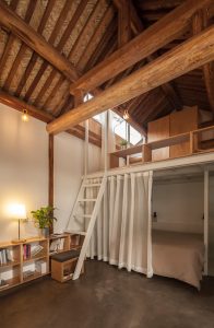
Chinese studio OEU-ChaO has renovated a residence of just 32 square metres in one of Beijing’s historic neighbourhoods with a white steel-framed extension and a lot of windows, for a young couple and their six-year-old son.
Architect Zhi Cheng added three lightweight steel structures to the property to bring more light into the space, creating a better relation to the garden outside, without damaging the existing wooden structure.

At the mezzanine level, it was installed the children’s bedroom, which can be accessed only by a ladder. It features a wooden shelf that acts as a headboard and study space. The space underneath is occupied by the parents’ bedroom and a toilet in a semitransparent glass volume.
A lightweight white drape can be drawn across the space to add privacy from the open-plan living, kitchen and dining room that occupies the rest of this tiny property. To maximise the size of this area, the architect arranged furniture and equipment around the perimeter.
Taipei City
In Taipei City, Taiwan, property prices are driving young buyers into very small homes. This compact flat of 22-metre-square includes a bath, floor-to-ceiling storage and even space for exercise. The architects at A Little Design managed to make the best of this space, for a young woman who travels frequently for work, and when she gets home “all she needs is a hot bath and a good sleep”.
They replaced the former shower with a full bath and moved the washing machine to the kitchen, an area with limited functions. The storage was more than enough for their client, featuring wardrobes on the bottom and square shelves on top.The clothes she needs every day are easy to reach to, but for books and other objects she has to use a ladder.

The mezzanine level, too shallow to allow standing, provides a bed and a small built-in desk, that can be used only by sitting cross-legged on the floor.
Under the main window is an alcove that has been transformed in a relaxation space, after it was filled with low storage cabinets and topped with tatami mats. Even TV has its own place in this “match box”, under the stairs that lead to the mezzanine.